Tables & Graphs for Practical Chemistry (PDO)
PDO (Paper 3): tables and graphs with correct headings/units, consistent decimal places, best-fit lines, and gradients (rate graphs).
Continue where you stopped
The core idea
On this page
Learning objectives
- make and record observations, measurements and estimates;
- interpret and evaluate observations and experimental results;
Tables and graphs should let another person read the measurements without guessing. Units, consistent precision, sensible scales and clear plotting all contribute to that goal.
1. Definition
Presentation of data and observations (PDO) is recording results in clear tables and graphs with correct headings, units, and sensible precision.
2. Key Ideas
- Every table column needs a heading + unit.
- Keep decimal places consistent down a column.
- For graphs: label both axes + units, use a good scale, and draw a best-fit line/curve.
- For rate experiments: gradient can represent a rate (e.g., volume vs time).
3. Detailed Explanations
- IV (what you change) → table first column, x-axis on graphs.
- DV (what you measure) → table second column, y-axis on graphs.
- Put units in the heading/axis label, and keep decimal places consistent down a column.
A. Tables (Headings, Units, Precision)
Good table headings look like this:
| independent variable | dependent variable |
|---|---|
| concentration / mol dm⁻³ | time / s |
| time / s | volume of gas / cm³ |
Write “time / s” as the heading. Do not write “s” after every number.
B. Graphs (Axes, Scale, Best Fit)
| Rule | What to do |
|---|---|
| Axes | IV on the x-axis, DV on the y-axis |
| Scale | use most of the graph area (no tiny graph in a corner) |
| Points | plot points accurately (use crosses) |
| Line | draw a best-fit line/curve (do not join dot-to-dot unless told) |
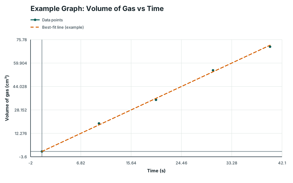
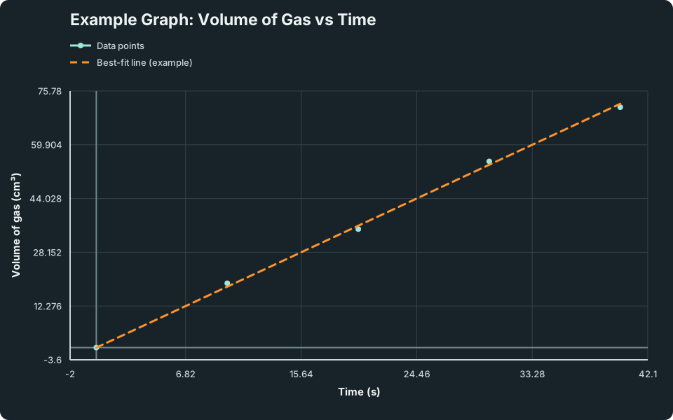
Example: a scatter plot with a best-fit line (axes + units must be labelled):
Example Graph: Volume of Gas vs Time
Example of a scatter plot with a best-fit line, correctly labelled axes and units.
Scroll across the graph to read all labels.
View figure data
| Series | Time (s) | Time uncertainty | Volume of gas (cm³) | Volume of gas uncertainty |
|---|---|---|---|---|
| Data points | 0 | 0 | ||
| Data points | 10 | 19 | ||
| Data points | 20 | 35 | ||
| Data points | 30 | 55 | ||
| Data points | 40 | 71 | ||
| Best-fit line (example) | 0 | 0 | ||
| Best-fit line (example) | 40 | 72 |
If your x-axis is categories (not a number line), use a bar chart:
Data table
| Condition | Result |
|---|---|
| No catalyst | 12 |
| Catalyst A | 45 |
| Catalyst B | 30 |
C. Gradients (When a Gradient is a “Rate”)
If you have a straight-line graph, gradient is:
Example: volume (cm³) vs time (s) → gradient has units cm³/s (rate of gas production).
4. Common Mistakes
- Missing units in table headings or axes labels.
- Using mixed decimal places in one column (e.g., 24.0, 24.05, 24.1).
- Putting DV on the x-axis.
- Drawing dot-to-dot when a best-fit line is expected.
- Ignoring anomalous points (or deleting them without comment).
5. Exam Tips
If one point is far from the pattern, circle it and state “anomalous”. Do not force the best-fit line to pass through it.
6. Worked Examples
Modelled example 1
Fix the Table Headings
Problem
Study the worked solution
Name each measured quantity
Method
Use “time” and the more specific “volume of gas”.Reason
A reader must know exactly which quantity each column records.Working
Quantities: time; volume of gas.Add units to the headings
Method
Writetime / sandvolume of gas / cm³.Reason
Units belong once in each heading rather than after every data value.Working
time / s; volume of gas / cm³.
Guided practice 2
Choose the Correct Graph
Problem
Classify variables before plotting
Hints
Hint 1: axes
Hint 2: variable type
View solution step by step
Assign axes
Method
Place concentration on x and time on y.Reason
Concentration is deliberately changed; disappearance time is measured.Working
x: concentration; y: time.Choose the graph
Method
Plot a line/scatter graph with an appropriate best-fit line or curve.Reason
Both variables are continuous and the graph should show their trend.Working
Concentration against time, with labelled units and best fit.
Common misconception 3
Decimal Places in Burette Readings
Learner table
Apply one justified precision throughout
View solution step by step
Identify the issue
Method
Identify inconsistent decimal places.Reason
All values in one measurement column should reflect the same apparatus resolution.Working
Given precision varies from one to three decimal places.Standardise the records
Method
Record each value to two decimal places.Reason
This is the expected precision for standard burette readings.Working
12.20, 12.25, 12.25.
Challenge 4
Gradient Calculation
Graph-to-rate transfer
Use changes across a large triangle
Hints
Hint 1: formula
Hint 2: units
View solution step by step
Find coordinate changes
Method
Subtract the two y-values and the two x-values in matching order.Reason
A gradient measures vertical change per horizontal change.Working
Δ V = 84-24 = 60 cm³; Δ t = 40-10 = 30 s.Calculate and unit the gradient
Method
Divide 60 by 30 and attach cm³/s.Reason
Volume is the y quantity and time is the x quantity.Working
gradient = 60/30 = 2.0 cm³/s.
7. Mind Stretchers
Mind stretcher 1: Bad Scale ChoiceExtension
Question: Your x-axis goes 0 to 100, but your data only goes 0 to 20. Why is this a problem and what should you do?
Show Answer
Answer: The graph becomes too small to read accurately, so plotting and gradient become inaccurate. Choose a scale that uses most of the graph paper, e.g., 0 to 20 (or slightly above).
Mind stretcher 2: “Join-the-dots” vs Best FitExtension
Question: Your data should form a straight-line trend, but one point is off due to a leak. Should you join dots, or draw a best-fit line?
Show Answer
Answer: Draw a best-fit line based on the overall trend and treat the off point as an anomaly.
8. Quiz
Ready to check your understanding? Try the interactive quiz, then review any questions you missed.